Press

The 4 Ps of creativity (thanks Mel Rhodes, 1961) are person, process, product, and press. Each is important as one ponders creativity — what it means, how we might support it in ourselves and others, what it looks like, or how we might teach it.

My favorite P has always been press. I even had a paper published about managing the classroom press for creativity. It’s not that I don’t like the other 3 Ps, press just resonates with me. The other Ps exist — and flourish or not — within the press. That’s critical. Plus, I love constructing creativity, joy, possibility, and relationship enhancing press.

So, you may be wondering, what is press? Press is what presses on us. It’s the environment — inside and out — that supports us, challenges us, encourages curiosity and creative and critical thinking, helps us learn, or that makes all that quite difficult.

Recently I thought “Press is a lot like the setting of a story.” I mention that because we tell a story each time we write, or share ideas — about creativity or anything else. Thing is, we don’t always share the setting of our story. Sometimes we share about ourselves, or our process and product. Much less frequently we talk about our setting. That’s unfortunate, because, when we don’t share the setting, when we don’t talk about the things that press on us, we don’t tell the whole story, or worse, we tell a story that is less than accurate. That may make it more difficult for others to be creative because they think their press couldn’t possibly be like ours. We must have a lovely studio, or an amazing library and set of colleagues, or a fantabulous mental press. Instead of working where they are, or enhancing their particular press, they search for some elusively perfect setting instead of just sitting down, wherever they are, and getting to it.

So, to encourage you to start wherever you are — with whatever space is available — I thought I’d share a bit of my press with you.

My physical environment doesn’t always look conducive to thinking, or making. Often I’m grabbing a corner of my kitchen island, surrounded by the stuff of life. Sometimes that stuff feels like clutter — and I neaten up or find a new space. But, other times it feels like home, reminds me of who I am, and gives me the support and shelter I need to think, risk, and create. Funny, sometimes things that seem incongruous to positive press remain near me. That little pill bottle in the photo is part of my cancer meds. That’s a big press on my life these days and I try to embrace it as a normal part of my press. Thankfully, today I’m experiencing the presence of that bottle as positive and encouraging.

I think I may be the poster child for unusual creative thinking spaces. The other night, I needed a quiet, slightly dark space to manage the blechiness that I felt. At the same time I wanted to connect with art and learn some new things. That night, my press was the comfort of my floor, wrapped in a blanket, light flooding softly from my bathroom into my room. Interestingly, the connection between the two physical settings is a sense of solitude, combined with a relatively intense experience of being safe, centered, and comfortable.

Our inner press is also really important. Sometimes my inner critic rules my mental and emotional press — cranking at me about my work or ideas. I’ve been working on quieting that voice, with affirmations, acknowledging other’s positive reviews of my thought and work, and just enjoying a beginner’s mind. Consequently, and thankfully, lately my inner press has been hopeful, open, and helpful. The positive inner press, open to possibility, and learning, helps me make connections, entertain new ideas, risk, learn, and experience joy and hope in the process.

Thinking about, and sharing, my own press, encourages me to consider the press of others. What presses on my students, my colleagues, my friends and family, and the people who get on my last nerve? It’s important to be cognizant about the press others exist within, to act out of that understanding, and to do what we can to positively impact the press of others.

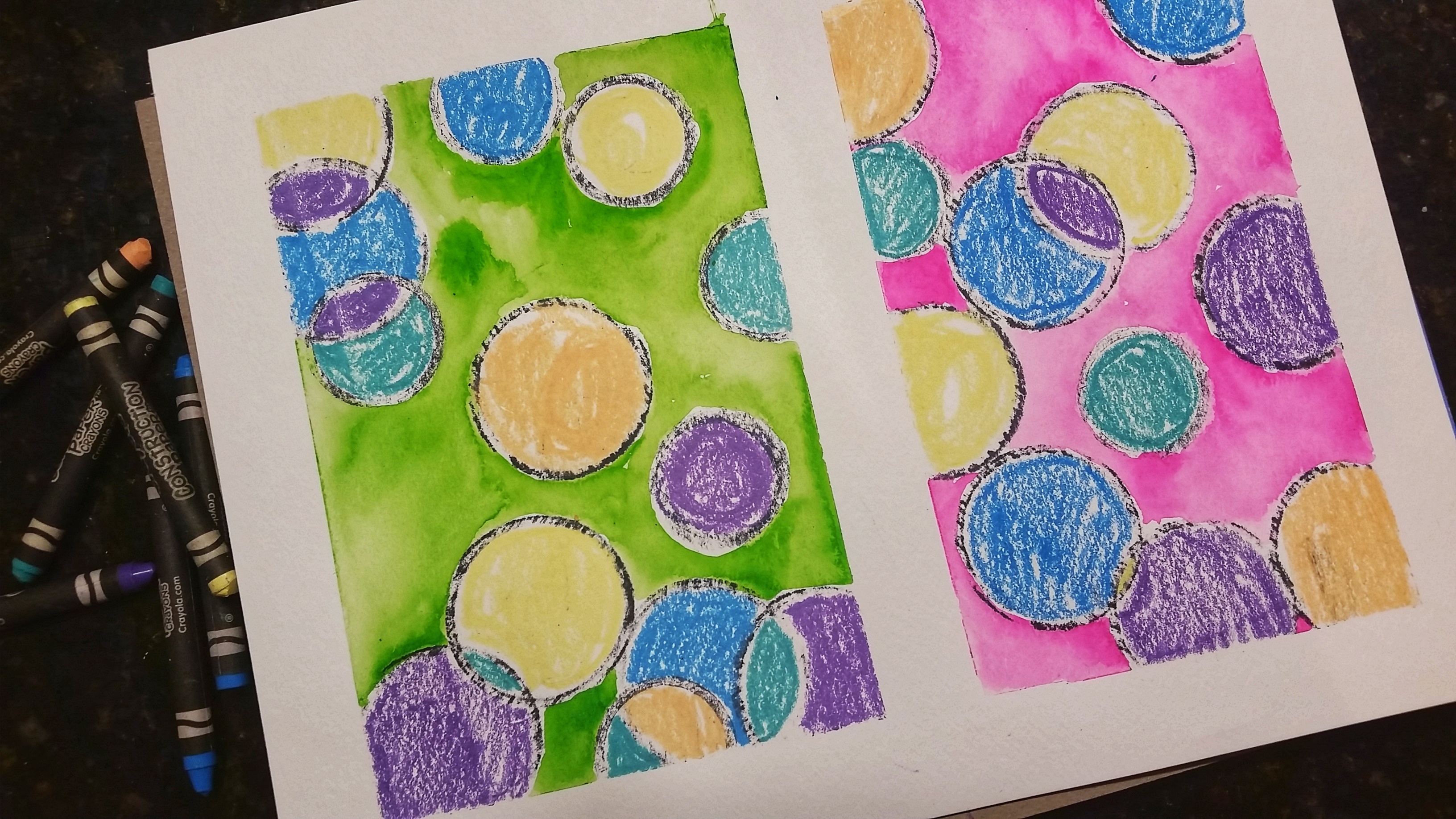
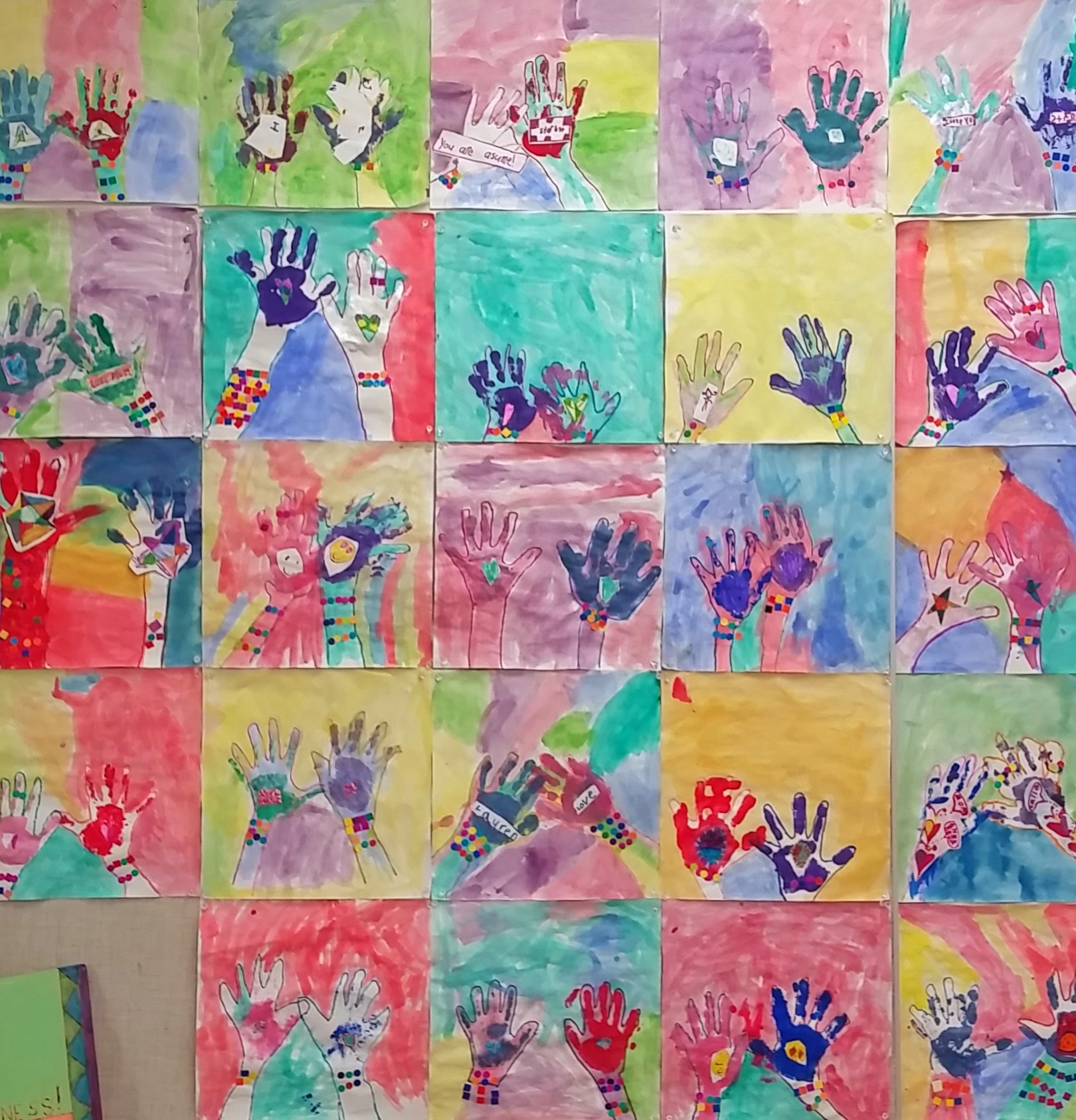
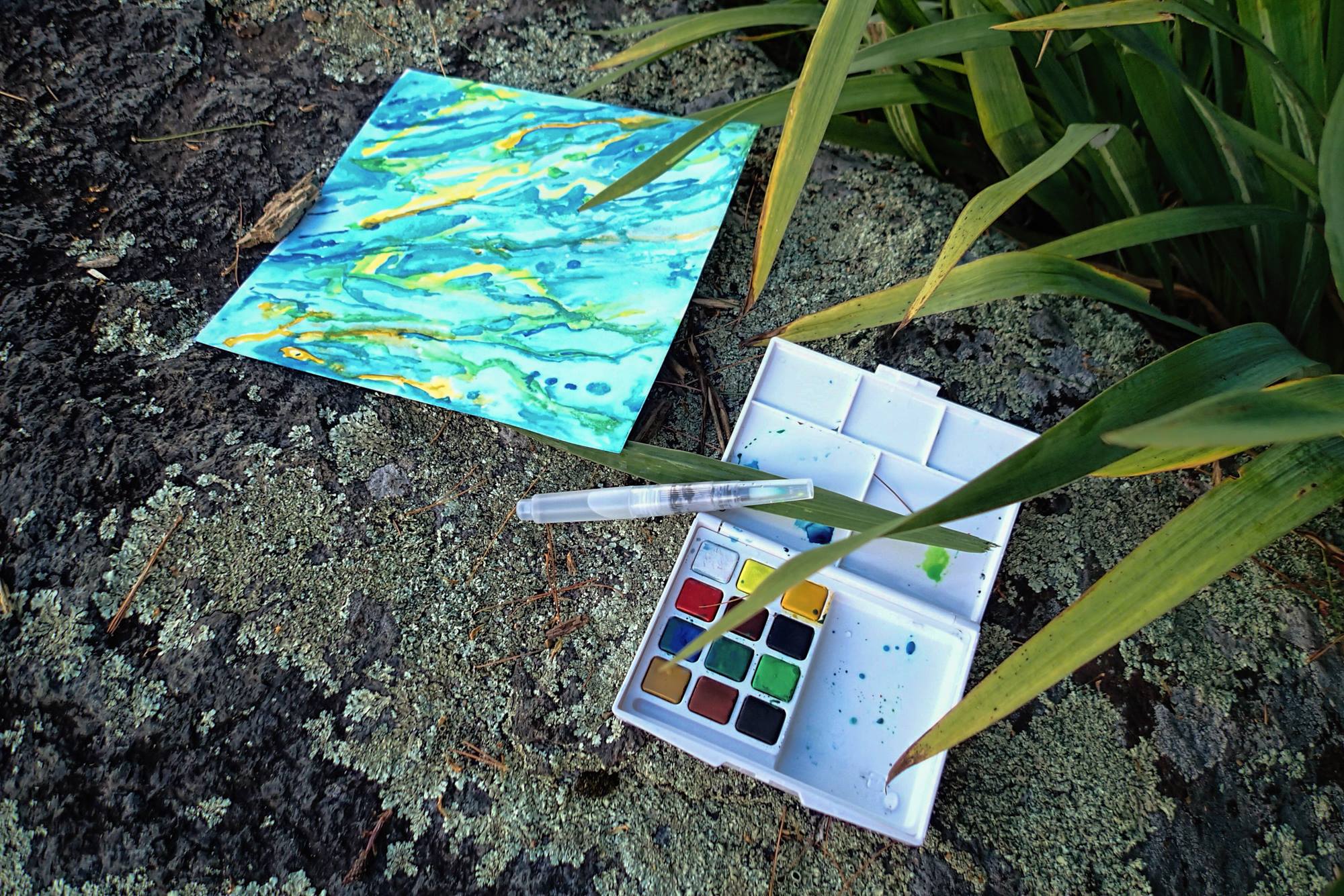
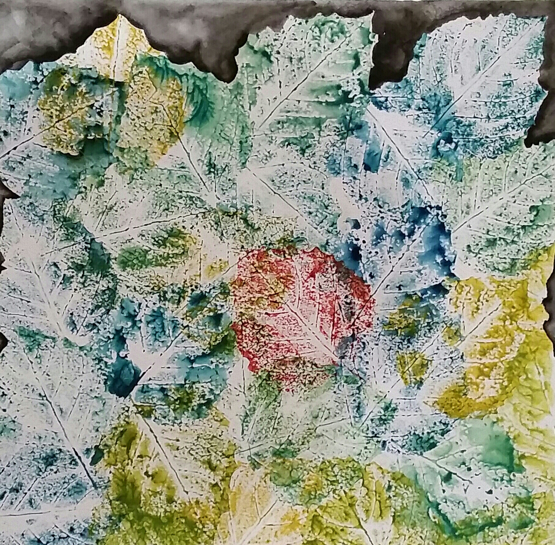
One quick thought on creativity and art. I just read an article in which the author lamented the many times creativity and art are linked with one another. I agree that creativity is not synonymous with art. Incredibly profound and valuable creative thinking happens outside of the art world. However, art is a part of my creative world. When I make art, I research, ponder, reflect, observe, take notes, think creatively and critically, problem solve, and often innovate.

Advertisement

I Wonder …

…what my Kindergarten artists will think, do, and feel when we work on this art process and product.

I am super hopeful …

  • their big beautiful brains will be filled with ideas and wonder.
  • they will jump in with confident hope.
  • they will experience the joy and excitement I feel when I create art.
  • they will know they are artists who can make decisions about their art.


These are my practice, and inspiration pieces.

20171011_182344-01

After making the first piece, I tried another using the new stamp pads I bought for my Kindergarten artists. As I prepped the page, I wondered what it would look like if I added a piece of tape down the middle.

I like it, and am adding it as an option for my Kindergarten artists.

20171011_203351-01

The boarders are created using frog tape. It creates a nice sharp edge, and even more importantly, can be removed without harming the paper. The circles are stamps created from some tubes one of the students brought in. I cut them on our bandsaw so I’d have enough to give each artist a small stamper and a large stamper.

My rules for the project will be:

  • Everyone needs a boarder.
  • Circles are colored with crayons.
  • The background is filled with watercolor.
  • Sign your work! (Which, by the way, involves many artistic decisions.)

My suggestions will be:

  • Consider overlapping the circles and letting the circles extend beyond the boarder.
  • Practice stamping on a scrap paper so you feel comfortable working on your piece.

My artists’ options and decisions will be:

  • What colors will I make the circles?
  • What color will I make the background?
  • Will my background be one color, or many?
  • Do I want a piece of tape to intersect my paper – creating two pieces?
  • Where will I put that piece of tape? (The options are endless!)

My jobs will be many:

  • To show the artists that unexpected things (tubes from shoes, painters tape) can be used to create art.
  • To expose them to the idea of combining various mediums into one project.
  • To encourage them to think.
  • To empower them to make decisions about their art.
  • To explain the rules … and the options.
  • To enjoy my artists, their process, and their products.
  • To document their process and work.
  • To be open to their interpretation of the process.
  • To be willing to allow them to modify the process … depending on their interpretation, desires, and/or needs.

All my jobs are important, but those last two, they are paramount.

If I want my students to know they are artists, and to actually BE artists, I need to give them the freedom and respect artists need, crave, and deserve. If I want them to learn to make decisions, problem solve, wonder, and create, I have to give them the space, empowerment, and opportunity to actually DO IT!


Student Voice in Art

I enjoy Andy Warhol’s use of bold, sometimes unexpected colors in his photographic prints. Some of my favorites are his flowers and Marilyn Monroe. Oh, lol, and his pink cow on a yellow background!

I pondered many Warhol inspired art projects for my Kindergartners. I wanted the project to have Warhol’s repeated images and use of bold colors, but I also wanted it to be child and time friendly. After many iterations I decided I would have them use their hands as the repeated element.

The steps I decided upon were:

  1. Trace each hand, with some overlap in order to create spaces on the page, and then go over their tracing with sharpie markers of their color choosing.
  2. Use liquid watercolor paint to create the background – filling the different spaces with different colors.
  3. Place their hand-print inside each drawn hand. (Painting each palm with a color of their choosing.)
  4. Use colorful dots and rectangular pieces to create bracelets on each of their wrists.
  5. Finally, create something to glue onto the palms of their hands.

I was very happy with the process, and mildly happy with how my sample turned out. I wished I could be very happy with my sample, but no matter how I tried to change it, I couldn’t get it to a place I loved, so I decided to stop fretting, trust the process, and see what my young artists were able to create.

Soon after beginning someone expressed alarm, “I painted the watercolor on one of my fingers. I wasn’t supposed to do that, was I?” All eyes looked to me. “No worries,” I said, “Look at the art Andy Warhol did. Does it look like he stayed in all the lines?” They responded with a relieved “No.”

Shortly thereafter, someone noticed a friend painting the inside of her hands. She seemed to have forgotten, or not really heard my instructions, or was just enjoying her process. “You’re not supposed to paint inside your hands with the watercolor! Right, Miss James? She’s not doing it right!”

The hand-painting artist looked up with a look of dismay. I took a breath and thought … What is really important here? Is it OK? Might she, and any other, paint inside the hands?

With that brief moment to think I realized what was important, and I said, “Well, I did say we weren’t going to paint inside our hands with the watercolor. But, do you think she is being inspired by Andy Warhol? Is she using bold, unexpected color? Is she making each hand different in some way?” They all responded, “Yes!” I smiled, and continued “I didn’t think about painting inside the hands with watercolor, so I didn’t do it. And, I didn’t suggest it to you. But, I think it’s a great idea. If you like it, give it a go. Let’s see how they come out.”

Everyone went back to work. As I walked around the room I was amazed by the beauty and depth in these Kindergartner artists work. It was far more lovely than mine. I told them “Wow! I love your ideas and your work. Painting the insides of your hands, and using so many colors for the background were really beautiful ideas! I think what you have created is so much better than mine. Thank you for sharing your ideas and art courage with me! I’m going to share your ideas with the artists tomorrow! (Art is done in half groups.)

20170201_154813-01-01


I could have easily said “No!” when asked if they could deviate from my process. I could have required them to work with my ideas, my thoughts, my creativity. But, I – we – would have lost so much if I had! Being clear about what was important – following the big ideas of Warhol’s prints, and finding our own artistic voice – I was able to let go, quiet my voice, and let their voices grow strong.

I’m so glad I did.


Hiking Art

I bought a travel watercolor set to have with me in my pack on my hikes this week. It’s a nice Sakura Pocket Field Sketch Box. I got it in an awesome little bookstore on the main drag of Lake Placid that has an amazingly nice art section! It was an impulse buy on a rainy day walk into town.

I’m not a trained painter so I looked for creative ways to translate the nature and inspiration I experienced on our hikes, using  watercolors.

We did a short hike out to Moose Pond. It’s a beautiful spot to sit, breathe, pray, eat, and relax. The water inspired me that day. I thought about wetting the entire page with pond water, but wasn’t sure what I would do next. So, I did nothing! I sat, looked, and just experienced the place. I noticed irises growing between the cracks in a rock on the water’s edge. That sparked an idea! If I used one of the leaves to put the pond water on the page, I might be able to mirror the feeling of the water – movement, sunlight, colors, and flow.

13963044_10210412623091440_954338476581758913_o

Baxter Mountain was our next hike. The wind at the top was sensational. It was my inspiration that day. But, how to show it?

The sound and force of the wind is hard to miss. It almost constantly moves the leaves and  actually changes the way tree branches grow. I love the sound and force of the wind, and the shaking of the leaves was a visual cue, so I knew I wanted to capture that … somehow.

It’s remarkable how awe inspiring, and moving (pun intended lol) the wind is to me. I absolutely love it. So, instead of of painting, I found several spots to sit, do yoga, eat, pray, and just let the wind buffet me. I collected a few leaves before we hit the trail off the summit, stuffing them in my pack to use when I got home.

Here’s my first leaf inspired piece.

20160821_150641-1-1

It took form as I worked. I wasn’t happy with it at first. But, I ignored my displeasure with the product, and kept going, enjoying the process. As I did, ideas came to me. I remembered a bubble art project I did with my Kindergarteners, and let that direct me.

I really like the abstract nature of the finished piece. And, I love the accessibilty and transferability of the method! I’m contemplating how to incorporate it into my class this year. It has nice potential as an art-science integration.

Rain has interrupted my hikes but not my art. Today I worked on getting watercolor paint to adhere to the leaves I gathered yesterday. My plan was to make leaf prints.

This is much harder than it seems. Close your eyes and imagine rain hitting the leaves. What does it do? Yup, it beads up! So guess what the watercolor paint does … beads up! Ugh! But, with a bit of stubborn persistence – wearing down the leaf it seemed, and getting the paint to the right consistency – it worked. The paint stuck to the water resistant leaf!

I am super happy with the result. The colors remind me of the leaves, sky and sun. The one in the middle is that one brilliantly colored red leaf we always come upon on our hikes. The black is the large rocks that encourage thousands of nature-filled step ups and downs on our hikes, as well as the small stones that sometime weigh down my pack. Next time I may put the black around the entire edge. We’ll see. It’s a process, and I’m loving it!

20160821_195737-1-1-1

Speaking of process, clearly my process involves mess! It never feels like mess while I’m working. It feels like (and is) immersion, beauty, intentness and art!

20160821_195704

But, yeah, my process is messy, and I’m good with that!


Expected, and Unexpected, Process and Product

“Would you come up with something creative we can do together at our next ELA meeting?” That simple question was the beginning of what would become, for me, a fabulous process and product!

It was a crazy time of year. We were all a bit stressed, with tons to do. “Perfect!” I thought. “Let’s take all that angst and struggle, and use it to make something beautiful!”

Our tools:

  1. sharpie markers (preferably black)
  2. old gift cards or credit cards
  3. acrylic paint
  4. canvas panel
  5. old magazines
  6. white glue
  7. bravery
  8. boldness
  9. openness
  10. joy

Our process:

  1. Think of all the things that are making us crazy, or cranky or stressed. As the end of the year approaches, that list can become very long. I encouraged myself, and my colleagues, to think of things from all areas of our lives.
  2. Write them down, in permanent, bold, black ink, all over the canvas. Be free! Write them one on top of the other. Make lists. Write big. Write small. Print. Write in cursive. Cross them out. Make them bold. Add lots of exclamation points. Curse if you like. LOL!
  3. Remember this is for you, no one else. No one gets to check it before you add the next step. No one sees it unless you choose to share. Be bold. Be brave. Be honest.
  4. When done, put the cap on the pen, and set it aside. Look at the canvas. Good? Anything else you want to write? Anything else you want to add? If so, pick up that pen again, and add it. If not, move on to number 5.
  5. Choose some colors. I like to be free, but mindful, in my color choices. Some colors become mud when blended. Sometimes muddy is good, but other times, not so much, hence the mindful part.
  6. Put  small dabs of the paints on a paper plate or tray.
  7. Using one of those old cards as a palette knife, pick up some of the paint and get it on the canvas. The card allows for a thick or thin paint application. Thick application can add texture or the possibility to completely obscure your words. Thin application allows for more layering of colors, and causes the texture of the canvas and the written word to be more prominent.
  8. Be free with the paint application. Don’t fret about mixing colors. Use only one card for the entire work. If you have too much paint on it, or want another color free from any other, grab a paper towel and wipe off the card. Experiment with thick or thin. (I like a thin application so the handwriting can be seen, but when it is your art, use your own preferences.)
  9. Flip through the magazines to find words or images that are the opposite of the words you wrote on the canvas. Find ones that inspire you. Search for beauty, peace, breath, love, laughter, or whatever else makes you say, “Oh, this is good!”
  10. Tear them out of the magazine! Experiment with different angles, with how much space you leave around the words, and with tearing in different directions. You might be surprised with all the variations you can get.  (If you must, lol, you can cut them out. But, if you can live with the possibility of ripping something wanted, and the less than perfect edges of the tear, then please, tear them. I promise, the results can be beautiful, and meaningful.)
  11. Once your canvas has dried, place these images and words on the canvas. Explore varying layouts. When you find one you like, use the glue to make it permanent. Be aware, if you haven’t cleaned your hands you may end up with some unexpected color. Don’t worry if that happens, there is one more step!
  12. When the glue has dried, add one more layer. Find or make a stencil and use it. Add color with your fingers. Grab a stamp and see what you can do with it.

Here is my final product.

2016-04-04 19.09.34

Or so I thought!

This is my product, and I love it, but it turns out it was not my final product. There was more. There was the unexpected process and product, and it was fantabulous!

As I drove home, my thoughts returned to the meeting, my colleagues, our process, and our product.  So many thoughts, observations and wondering. And then, my thoughts turned to my product.

“I wonder if I can read what I wrote? Maybe if I look really closely?”

There was definitely part of me that wanted to read them again. Hold on to them. Feel them again. Experience their power. Another part of me speculated it might have been better to have completely concealed my words under a think coat of paint. I resisted any urge to pull over and examine my canvas, lol, and reminded myself that the point of the process – outside of pure creativity and joy – was to let things go!

When I got home I pulled my canvas out of my bag, and spent some time with it.

I liked it. It wasn’t perfect, but it was interesting. It wasn’t flawless, but it was beautiful. And those imperfections and flaws? They added to its interest.

I couldn’t read my words, but I could see my writing, and I loved that! The writing added depth and texture to the work.

Then I had an aha moment … my final product (at least for now).

The piece was just like my life. Multi-layered. Not perfect, but pretty fabulous. And those things that make me anxious, stressed or cranky? Endured, survived, embraced, laughed about, cranked about, talked about, prayed about, and released – even if they remain in some fashion – they make me better, more interesting, more awesome, more me.


Save

Save

Save

Save

Save

Save

Save

Gustav Klimt and Kindergartners

Gustav Klimt is a favorite artist of mine. I enjoy finding ways to share his work with my students. Take a look at this work of his.

klimt-stoclet-fries-die-erfuellung.thumb.333x0x0x0x100x0x0x0

It is beautiful! Clearly it’s a masterpiece, and yet in many ways it is a work accessible to my kindergarten students. It is a combination of shapes – both in the detail and the figures.

I always have the girls work on a mixed media project when we are inspired by Klimt. I find it helps them express the detail he expresses when they have many mediums with which to work. Plus, it allows them to explore various mediums at the same time.

Typically, I bring in some of my art materials to share with them. They love the chance to use “real art mediums and tools” and treat all my things with the utmost respect. I love that my sharing expresses my respect for them as people and artists, and, hopefully, encourages them to be generous with the things they value.

This year I introduced them to Klimt while we were exploring shapes in math. I showed them full pieces, but spent most of the time drawing their eyes to the details and shapes found throughout his work. The girls enjoyed finding spirals, circles, squares, triangles, diamonds, rectangles and the many combinations of shapes Klimt created.

I decided to have the girls work on a trio of small art-pieces instead of one large piece. I hoped it might help them be more able to fill the paper with shapes. While I love having them work on large canvases, sometimes the size overwhelms them. We worked on 3×5 inch pieces of multi-media paper. When the girls were finished I mounted their work on a black background to create a triptych.

It was fabulous to sit and work with them. We shared pencils, artist markers, sharpie markers, a travel water color set, gel pens, crayons, pastels and security envelopes (fabulous idea I learned from Dar Hosta and Deb Barends).

“Oooh, I like that!” “Can I try that?” “How did you do that?” “Oh I never thought of that!” flowed across the tables as we admired each other’s work, and were inspired to give the new ideas a try. While they sometimes need a reminder, they are learning to see “copying” their ideas as a compliment rather than a transgression. I encourage those who “copy” to truly be inspired, and to make subtle, or large, changes in order to make the work their own.

I was, as always, impressed by their process and product. They have great, big, beautiful hearts and often it seems that beauty just flows out onto the paper. We learn from each other to be free with our work, loving the process and each other.

While I was working on a piece, one of the girls asked if I would like her to help me. “Sure!” I said, although I wasn’t sure what might be created. Her additions to the piece were wonderful, and made the piece much more beautiful than if I had done it alone!

I’m not sure anyone would realize we were inspired by Klimt, but we were, and we too created beautiful works of art. Here are a few from six of my students. Enjoy and be inspired!

girlsklimts

Resources:

Klimt Museum http://www.klimt.com

Writing and drawing … or, Kindergarteners tackling the blank page!

I enjoy the “mixed media” of writing and drawing. They compliment and enhance one another, making my art more satisfying and beautiful.

After working on my blank page art project I knew I wanted to try it with my kindergarteners. I wondered if they would have a similar experience of comfort using the magazine as a scrap paper journal, and their words as the background for their drawing.

It was fascinating to be part of their experience!

I began by sharing my own work – both my process and my product. I shared my reluctance to work on the beautiful, blank pages, as well as how free I felt using the magazine as scrap paper. I told them I loved being able to experiment on the magazine pages. I showed them my magazine drawings and talked about my thoughts – what I liked, what I didn’t like, how I studied the faces I found in the magazine, and how I eventually developed a face that I liked. I commented that I didn’t think it was perfect, but that I really liked it just the same.

I encouraged them to relax as they worked. “Don’t worry making mistakes. It’s all part of the process. Look at what you did. If you see something you don’t like, don’t fret, just do it again until you do like it.

I asked them to be free and soft – in their minds and in their bodies – as they used sharpie markers to make the faces. I reminded them there could be no erasing but assured them they would be fine.

They were very funny in their interpretation of my words. I had to explain to some of them – as the pen almost fell from their overly relaxed fingers – “Oh no, that’s fabulous, but you really do have to hold the pen with a nice grip. What I meant is relax your arm, make your strokes easy and smooth. Like this.”

I started by giving them a drawing technique that would allow them to be successful while at the same time, giving them the freedom to create “their own faces.” I told them they would be able to make as many faces as they liked, but asked them to make their first face by following the steps with me.

The technique was quite straightforward.

  • First a large oval for the head.
  • Then a column for the neck, with two small hills on either side to form the shoulders.
  • One long curved line for the eyebrows and sides of the nose came next. We noticed that the shape of the eyebrows really changed the emotion of our faces. We had a really tough time with the tip of the nose, so many left it out.
  • The eyes were almond-shaped with circles. We experimented with different sized almonds and circles. We placed the pupils in different places. Some of us added glasses. The faces had great character – even without lips or hair!
  • Lips were a bit tricky and some wanted to just make a smile. I told them they had to give the lips a try. After a bit of “ugh” and a sigh, they relented and tried. They drew awesome lips.
  • Some of us added ears – amazed that they actually go from the center of our eyes to the center of our lips. Finally we added hair.

mag work 3

My students seemed intrigued by my thought process and used my words throughout their work. One student drew something she didn’t like and said “Well, that’s ok, I can just go to the next page.” Another told me “I’m trusting myself, Miss James. I’m being brave, doing it and just believing it will come out alright.” It was absolutely amazing to see my words empower them!

After a good bit of drawing, it was time to fill a page with words that made them happy. I suggested they think of their handwriting as a beautiful part of their art piece. They worked hard choosing words and then filled the page with their handwriting. (It’s a LOT of work for a kindergarten student.) When every line was filled they were ready to make their final face.

_MG_2713

I gave them the option of practicing in their magazine again before working on their art piece. Some did, some didn’t, but either way, they were all engaged, confident, happy, and successful!

Our bulletin board is filled with different faces – each unique and fabulous – just like the artists who made them. Occasionally I shake my head, amazed that the artists are kindergarten students.

face 1

Why were they able to be so successful? I’m not certain, but I have some ideas.

I believe they are fantastic and capable. I value them and their work, and my behavior and language reflect that value.

  • I share my expensive art pencils with them (and they treat them like treasures).
  • I give them the best paper I can, and even if it is simple, inexpensive paper, I make sure it is worthy of their work – clean, cut straight, and unwrinkled.
  • I treat them as fellow artists.
  • I ask them to do art that I do – not just “kids” art.
  • I share my thoughts and work with them.
  • I don’t hide my struggles. I consider their suggestions and offer my own.

And, wow, there is something powerful about the process.

  • The technique is easy to remember but still rich enough to express the wishes of each artist.
  • There is a nice balance of structure and freedom.
  • There is the comfort of the non-blank page of the magazines and word filled pages.

And some how, that all combines to be magical, powerful and emboldening. I dig it!

RESOURCES:

Journal Spilling: Mixed Media Techniques for Free Expression by Diana Trout (2009)