I’ve taken a few moments to paint this weekend — which has been wonderful. I did these while hiking. The leaves are from a couple weeks back. The sky was a quick ten minutes paint as the sun went down yesterday.
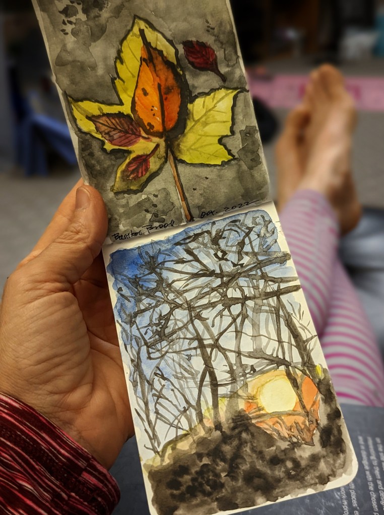
It’s interesting how different the sky watercolor looks now that it is dry, and being viewed with normal light instead of the setting sun light. The colors — even those I didn’t plan on being light — appear remarkably lighter now.
I’m pleased with the look for what it is and am going to resist any edits. However, I do want to remember just how much pigment is needed to have the watercolor dry a deeply saturated color. As I look at the leaves I’m recalling the amount of paint I loaded onto my brush to get those rich black shadows.
It’s so good to have pieces to look at and compare. It’s one of the things I like about my hiking watercolor journal.


This is a piece I started working on next to my Kindergartner artists. I used a combination of crayon and watercolor. It’s too bad I didn’t think to take a photo of the image before I added any color. It would be interesting to see how I react to it in comparison to the colored image and the black and white. I find both images satisfying. And, interestingly enough, I like the same parts in both images. It would seem that what I’m enjoying is the saturation as well as the actual color. I wouldn’t have guessed that before looking at them side by side. But, looking at them now, it makes perfect sense.
Ahhhh. Note to self. More painting, please.

